
Anatomy of a Breakout
A Look at Copper, Plus Trip to HK This Week

Back in the early 2000s, I received my first buyside analyst research coverage for an international smallcap equity team. I was asked with an assignment nobody on the team had looked at in years. When you’re starting out, you do the job nobody wants, and in this case I was analyzing metals, mining, and energy in a coverage which forever colored my knowledge and experiences in commodities, including in how I think about the present supercycle underway. It was a lonely job and there were very few of us in the sector, to the point where friends threw me sideways glances at a bar during the holidays of 2004 as I beamed about how oil had finally and definitively taken out $40/barrel…what a great year it had been! Nobody cared. Value-oriented L/S hedge funds were just starting to burst into their golden era. The predecessors to today’s large multi-strategy pod shops were still using night traders in NY to operate in the Asian emerging equity story and still one or two years away from opening offices in HK and Singapore. The crude oil price was oddly invisible.
To set the stage, you have to understand that the crude oil price had traded for decades in a range bounded by a ~$10 floor and $40 ceiling. The chart below from 1990-2010 shows you the pop to $40 during the first Persian Gulf War (Operation Desert Storm, red line) followed by a long road to nowhere in the 1990s and a few attempts at ~$40 in 2000 and 2003, before breaking out in 2004:
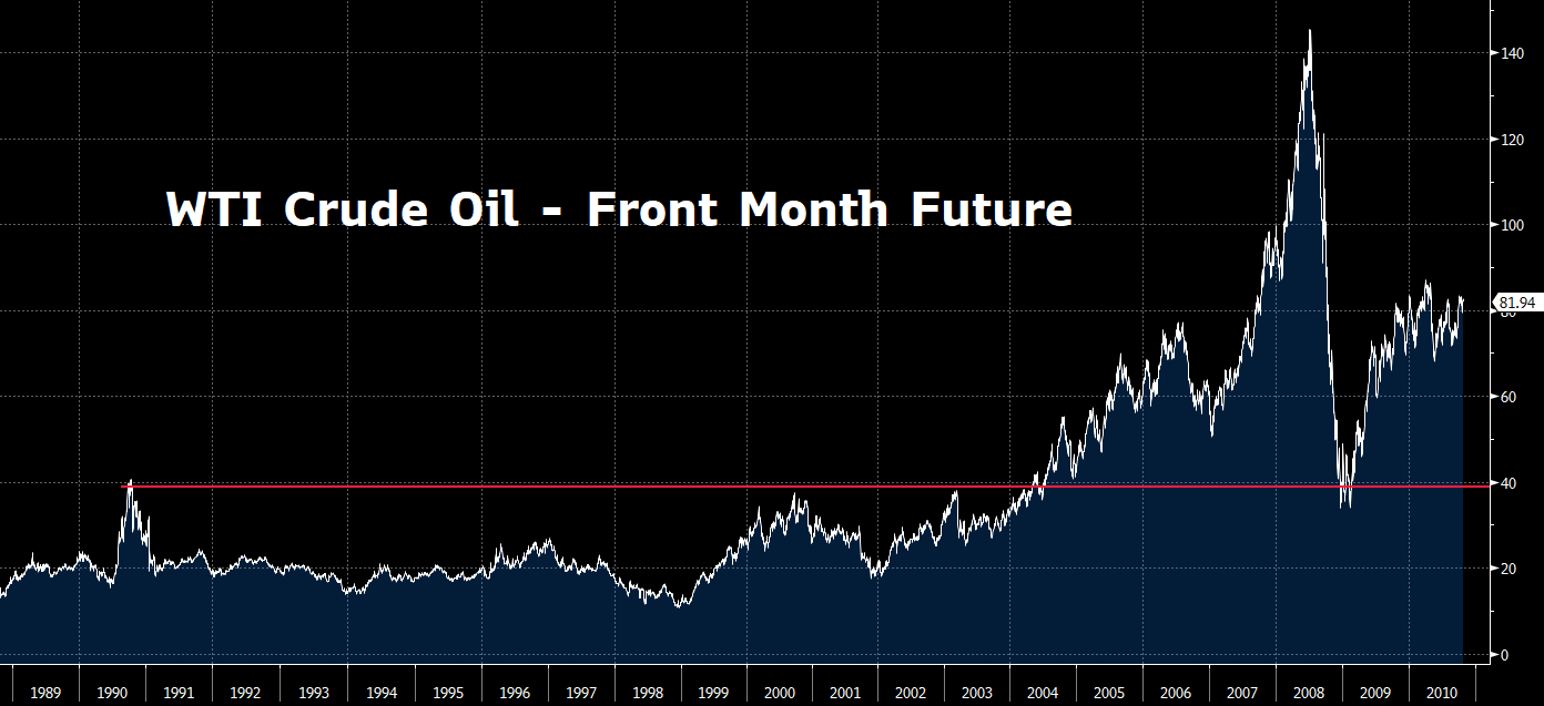
Source: PauloMacro via Bloomberg
Zooming in on the breakout… beyond the narrative around an emerging China story that was increasingly catching fire, a big sign for me that the landscape for oil had changed as we broke out of $40 in mid-2004 was actually confirmed by the evolution of the oil curve. By way of example, I will use the colors of the rainbow to show you progressive peaks from 2003 through 2005 as we broke out, and compare it to how the curve was behaving:
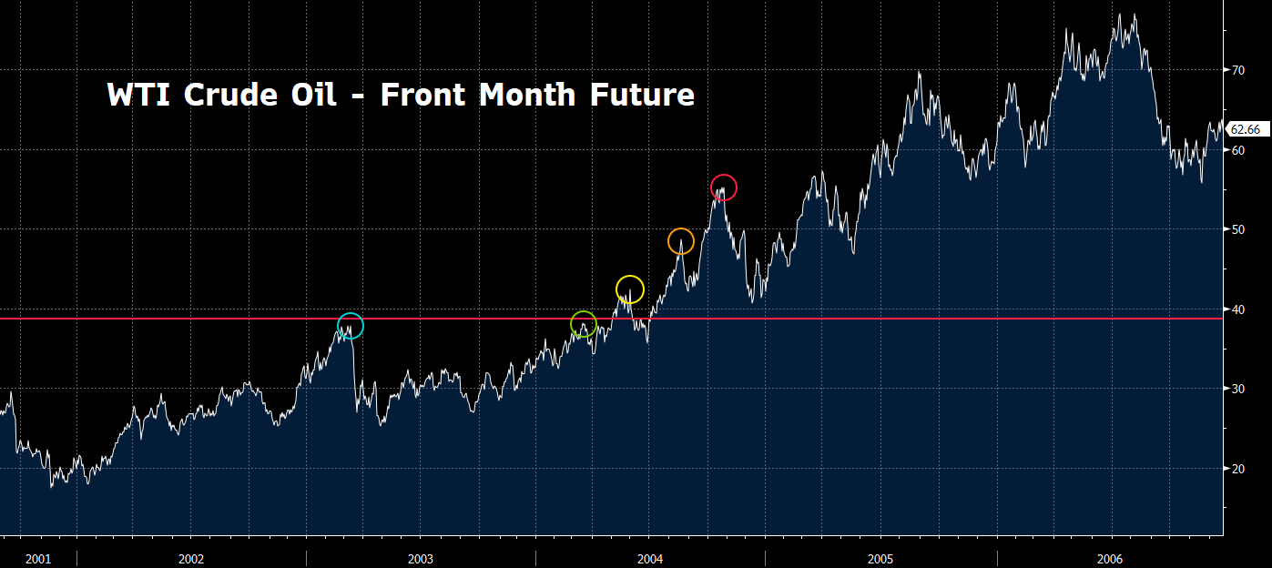
Source: PauloMacro via Bloomberg
And here are the WTI futures curves at those circled local highs:
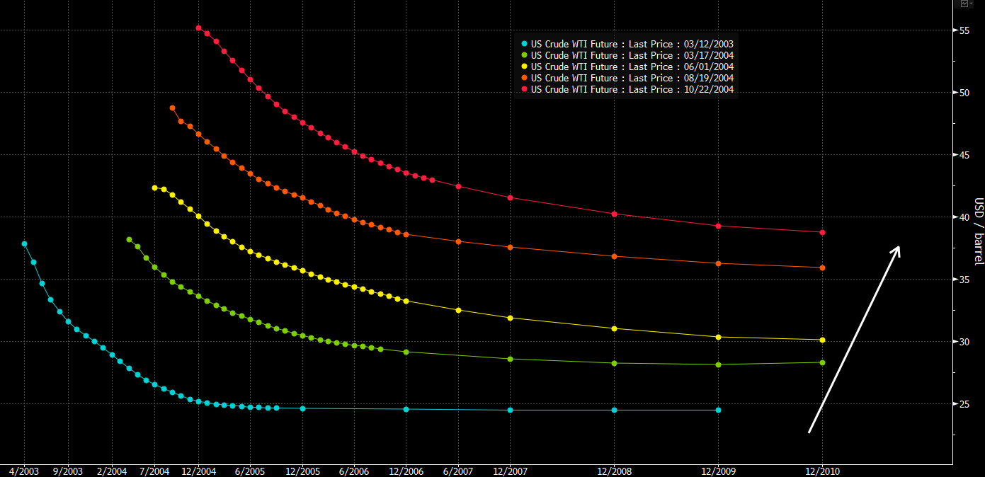
Source: PauloMacro via Bloomberg
The first point to note is that the curves were increasingly backwardating (where longer-dated prices are lower than near-term prices, a condition which punishes storage players who would otherwise run carry trades, and thereby calls inventory out into a tightening market). But more importantly, the entire curve was inflating, including the longer-term price as shown by the white arrow.
I bring this up because the copper price has been similarly meandering over the past two decades on a long road to nowhere, bounded on the top around ~$10-11k/ton: